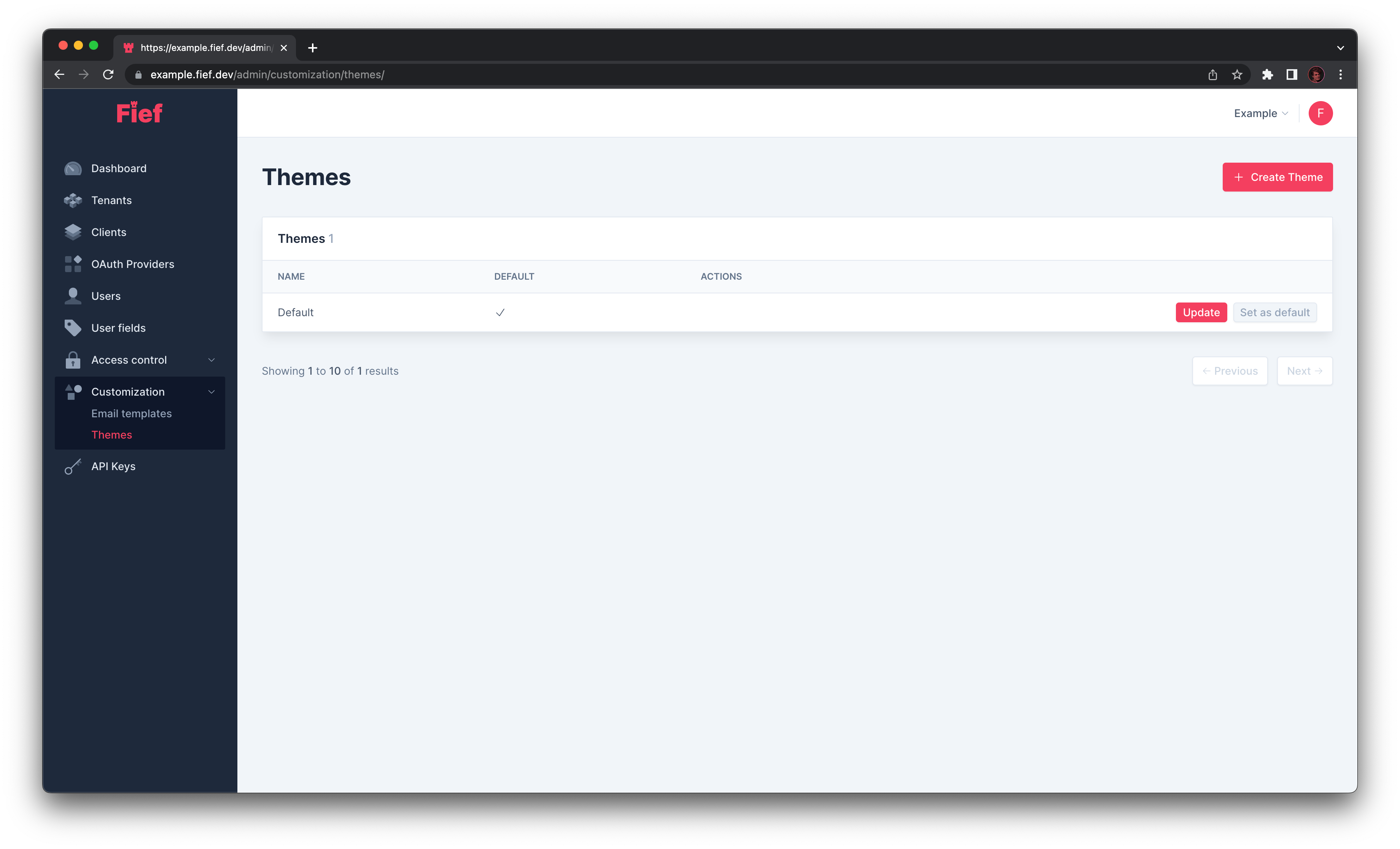
Themes
Fief comes with its own authentication pages for login, registration and reset password. You can customize them so they match the brand of your application. This is done through a system of themes. They can either be set globally, which is the most common case, or you can assign them to a specific tenant if you need to customize the look-and-feel per tenant.
When your instance is created, Fief will always create a Default theme.
Create a new theme
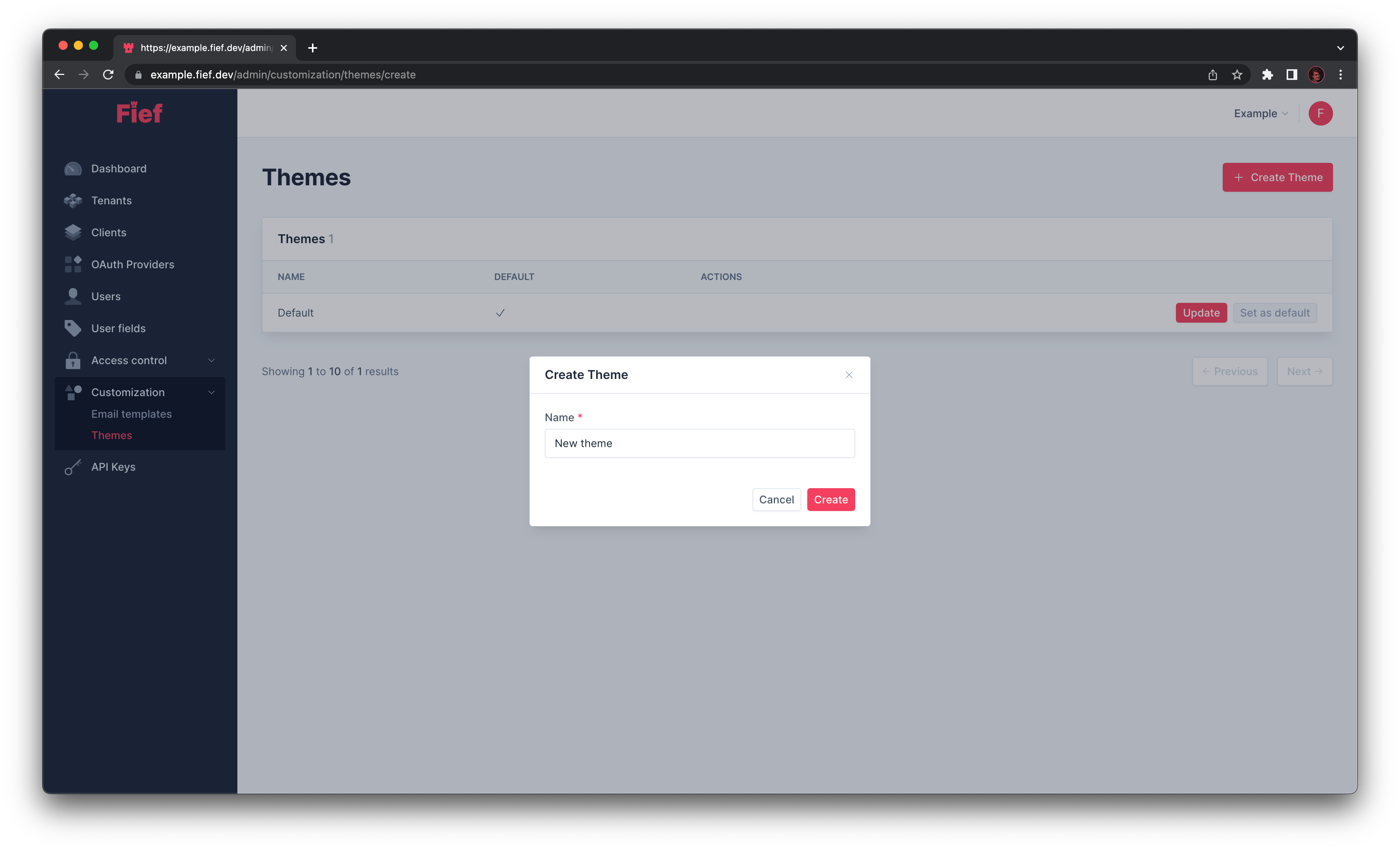
You can create a new theme by clicking the Create Theme button. A modal will open where you'll be able to input its name. You'll then be taken to the theme edition page.
Set as default
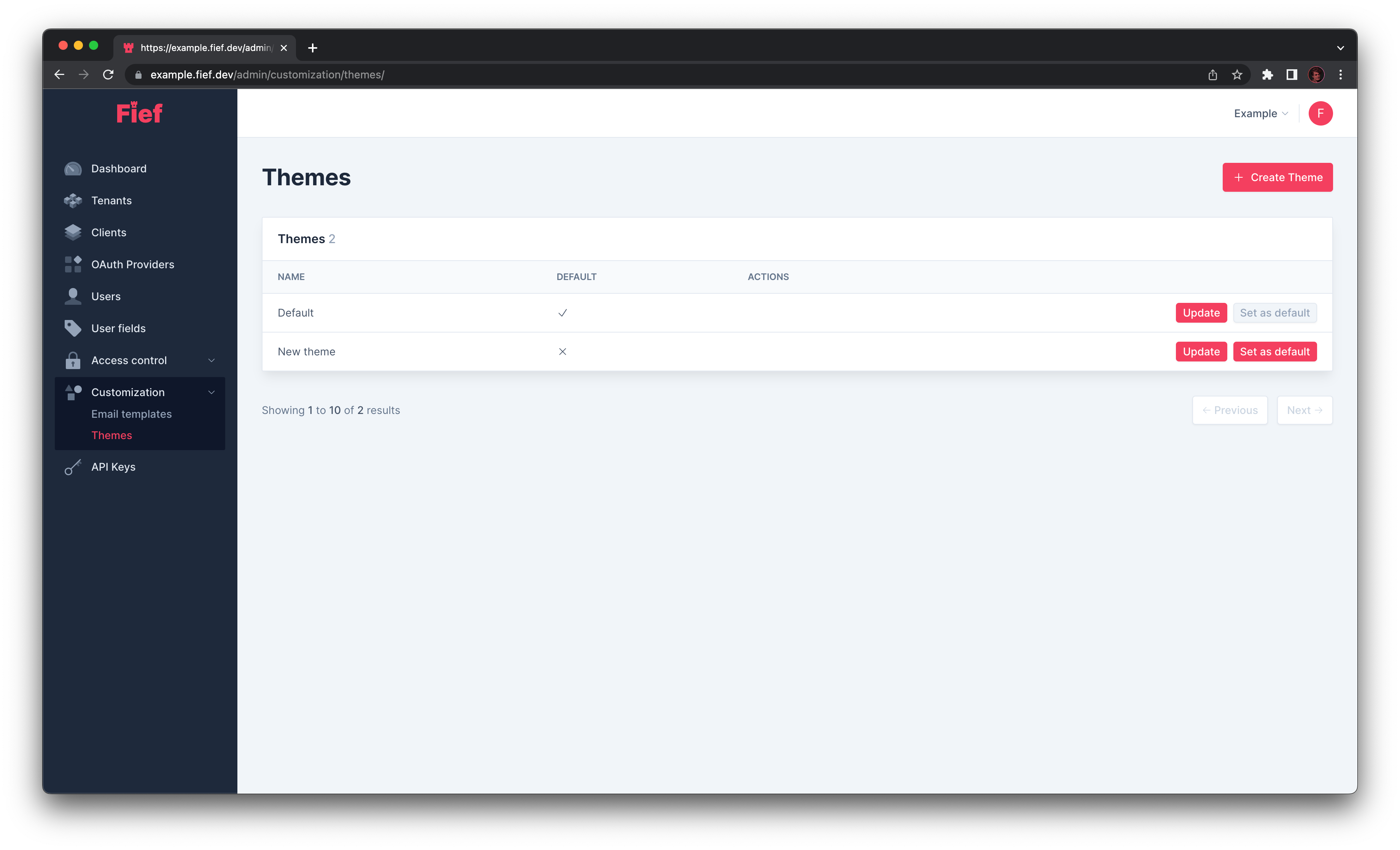
Unless specified otherwise, tenants will use the theme specified as default. To change the default theme, click on the Set as default button in front of the theme you want to make default.
Edit an existing theme
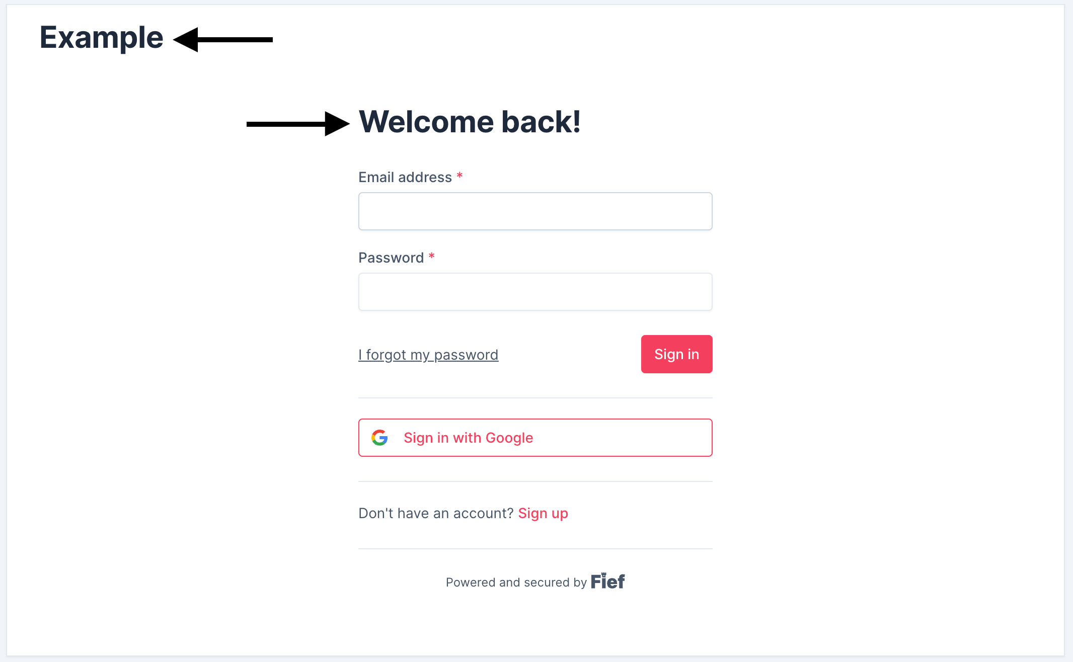
You can edit an existing theme by clicking on the Update button in its row. An editor will open, with the customization parameters on the left and a preview on the right.
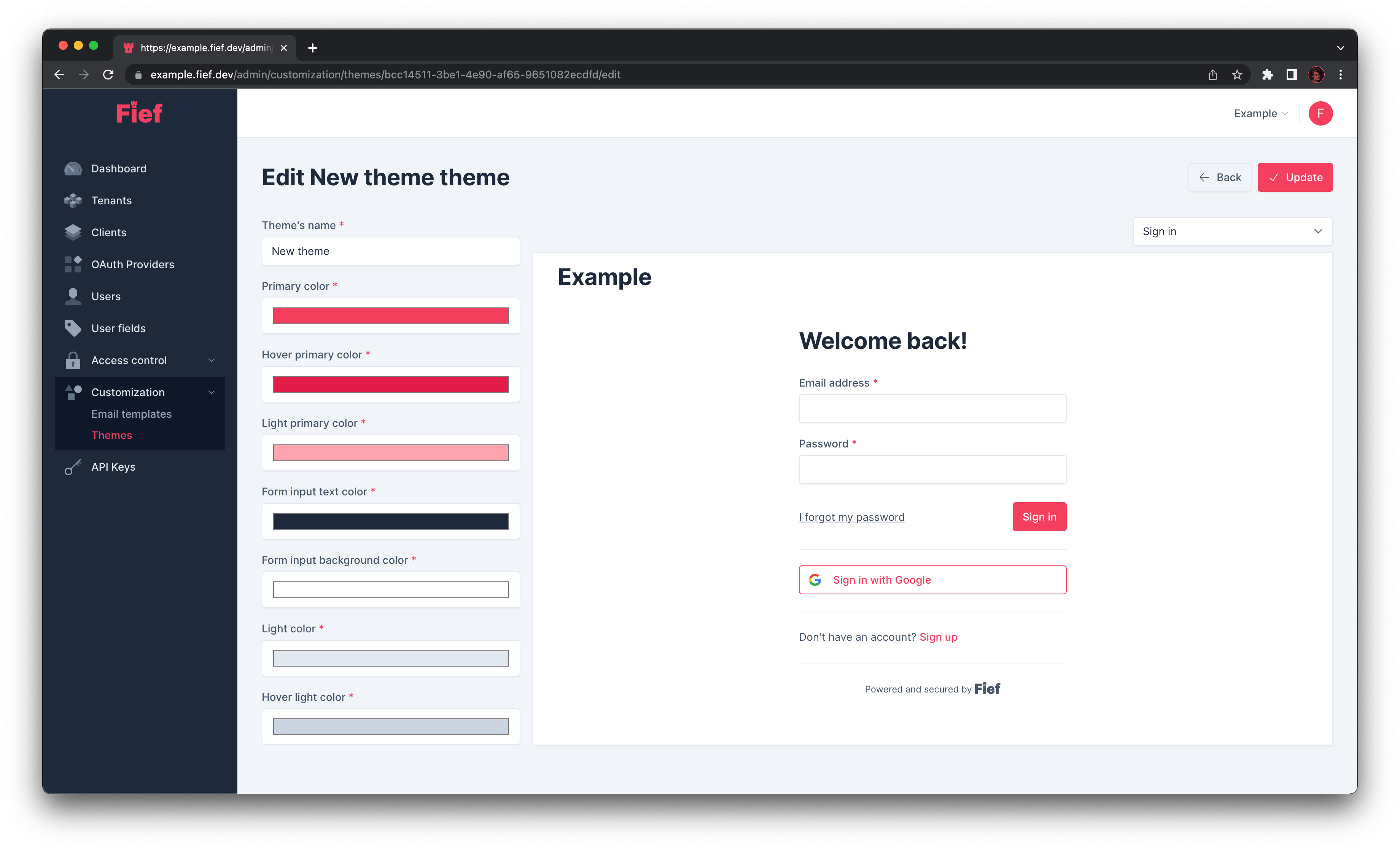
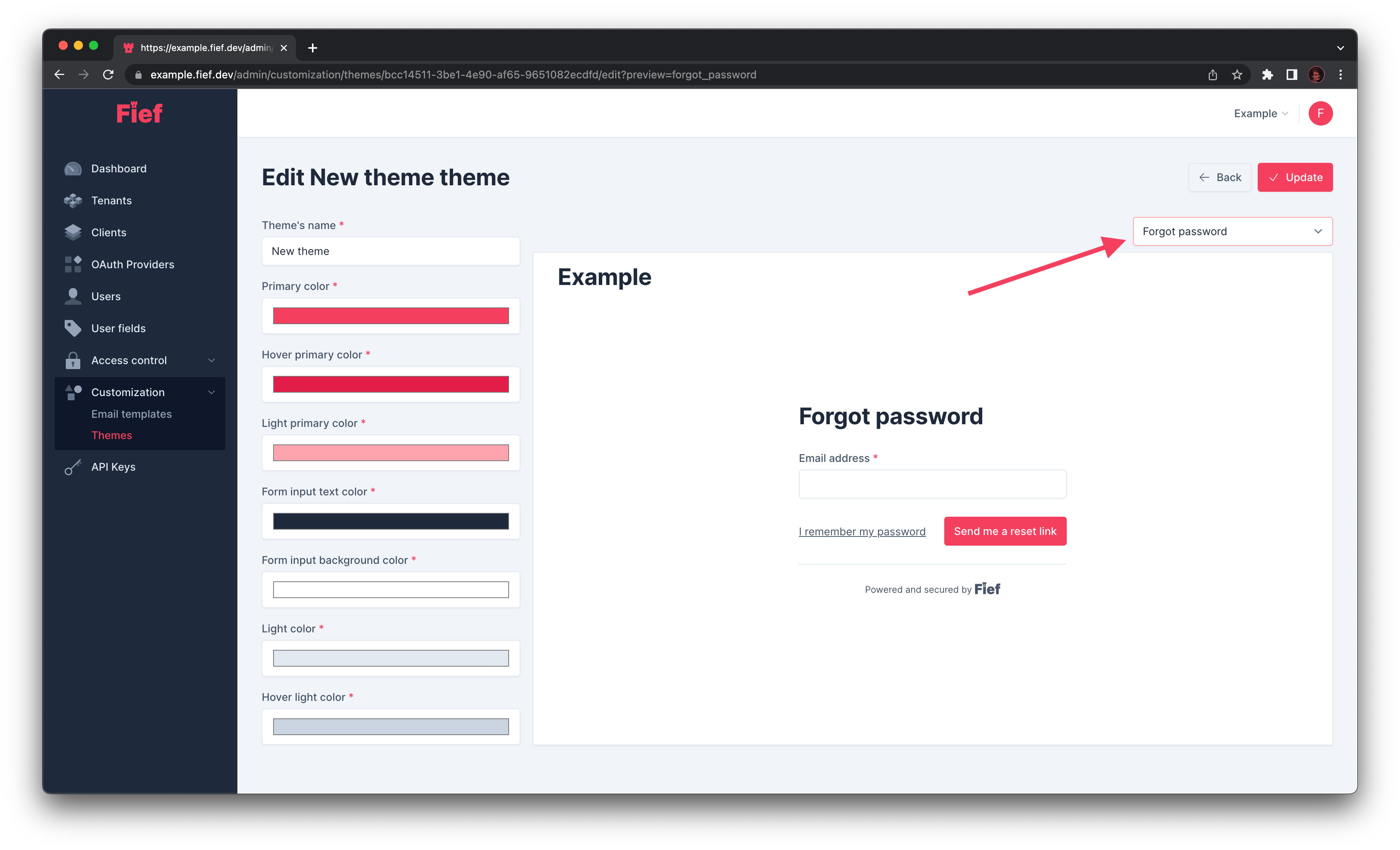
You can switch the page to preview using the select menu above the preview.
Customization parameters
You'll find below a description of the customizable parameters and what is their effect.
Themes's name
This is the name of the theme. It won't be shown to the end-user, it's just a way for you to easily identify them.
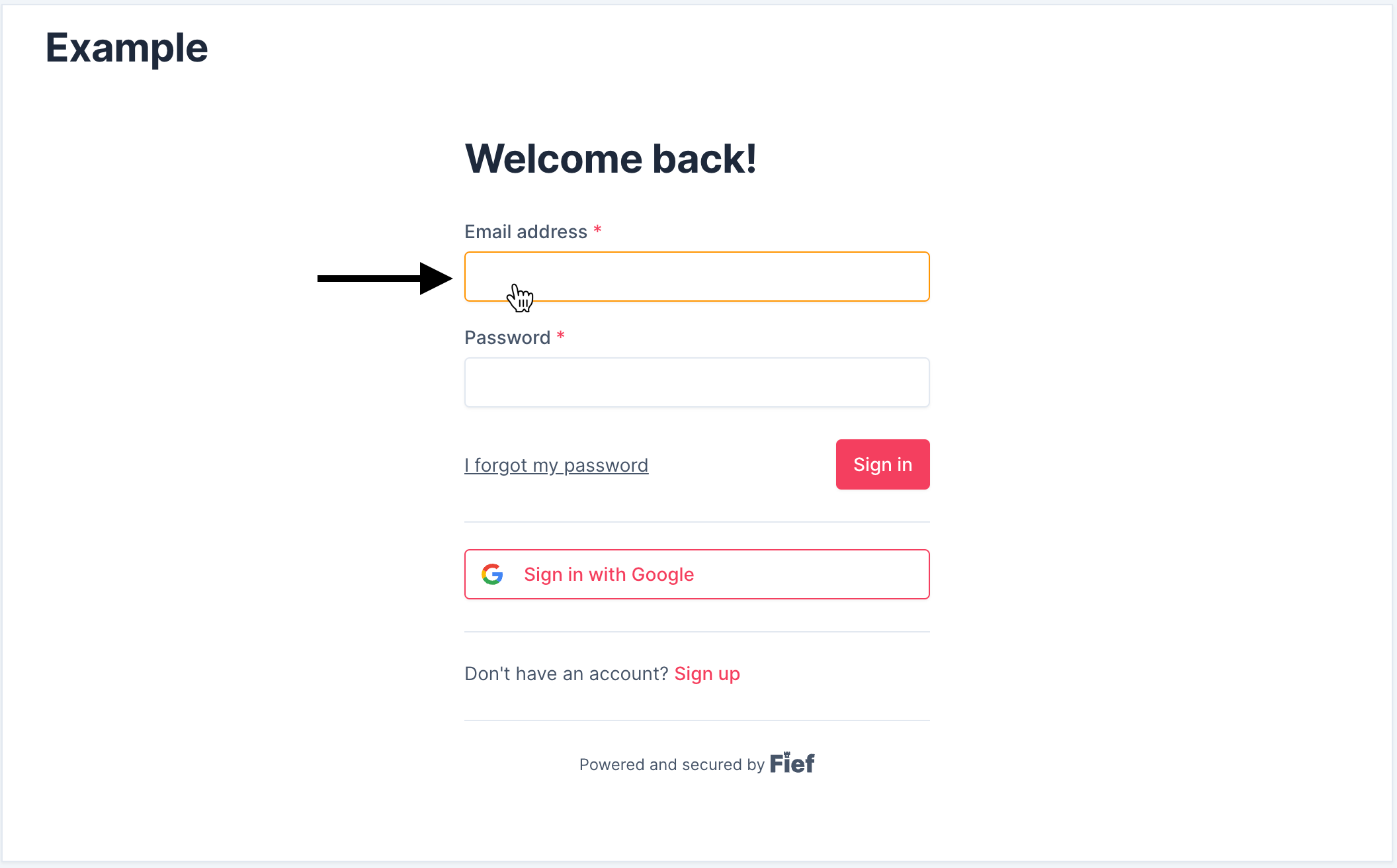
Primary colors
Primary colors correspond to the colors of the buttons, links and form focus borders. This is usually your "brand color".
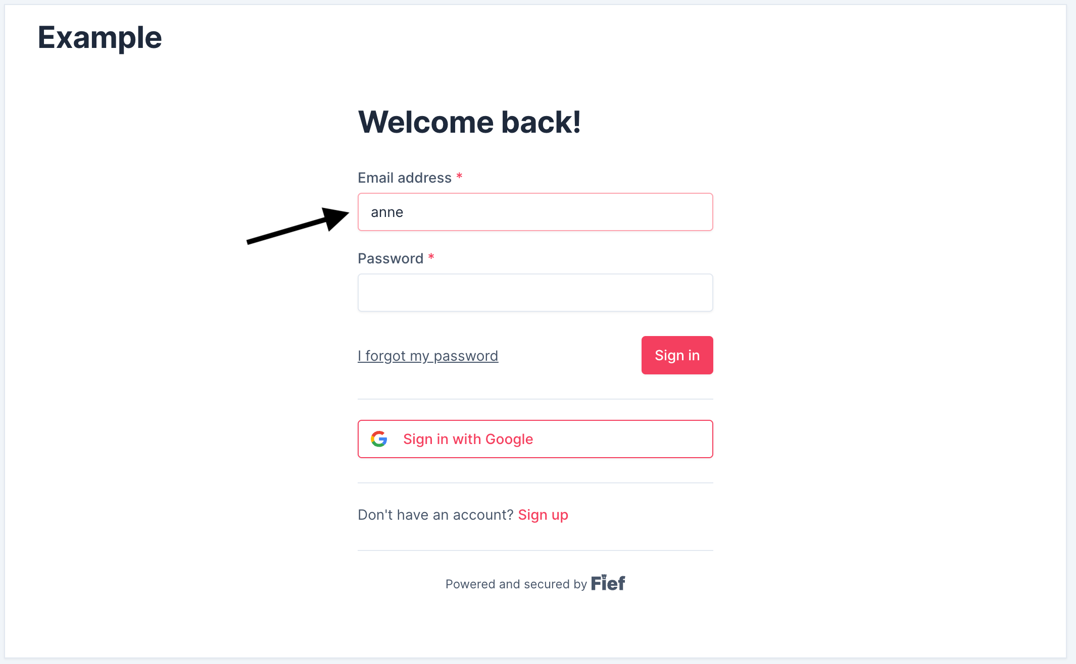
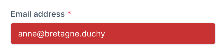
Form input colors
Form input colors respectively control the color of the text and the background of the form inputs.
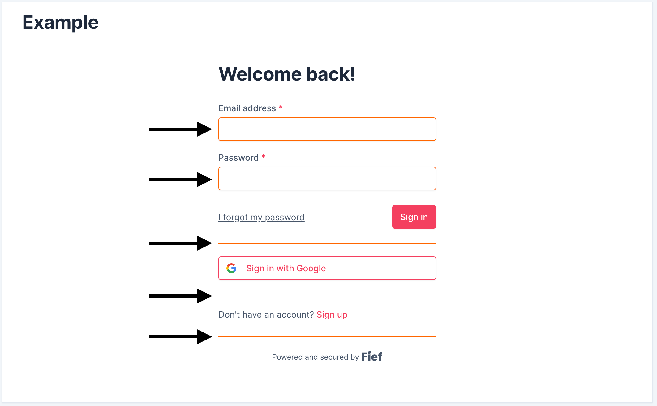
Light colors
Light colors control the color of the borders, in particular the ones on form inputs.
Text colors
Text colors control the color of the content and headings.
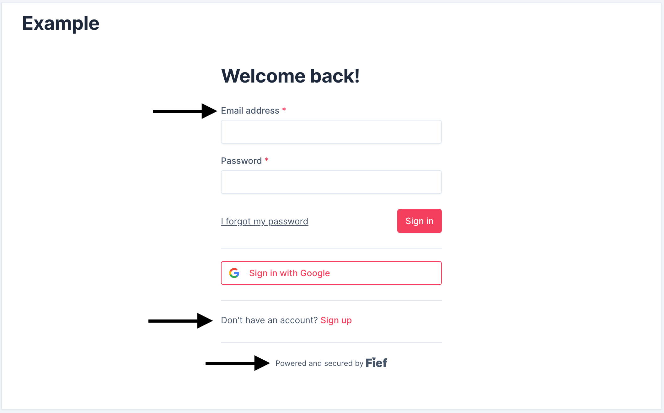
Background color
Background color control the color of the whole background.
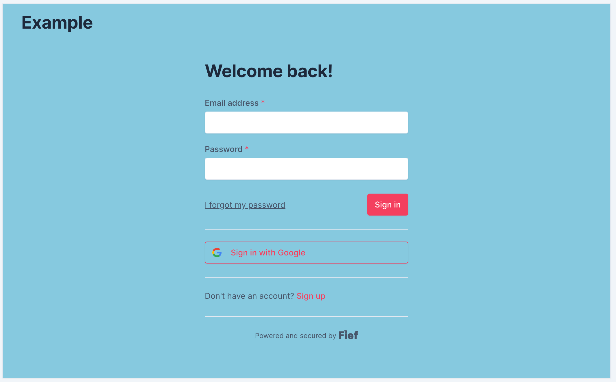
Fonts
There are three parameters to control the fonts:
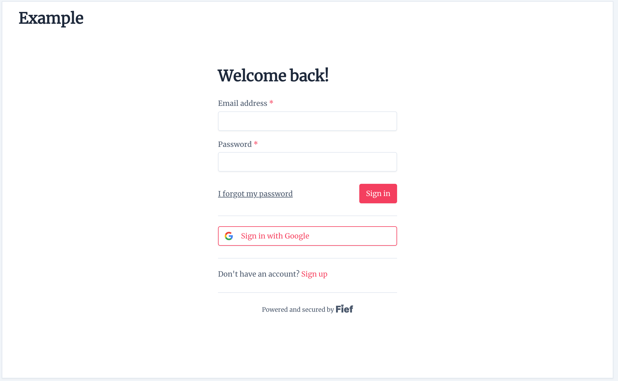
- Base font size: base size of the text, in
px. Other font sizes (like headings) are proportional to this size. - Font family: the font to use. It should be a valid CSS
font-familyproperty. - CSS font URL: allows you to import custom fonts, like the ones from Google Fonts. The URL should point to a valid CSS file with
@font-faceinstructions.
The example below shows you the result with 14, 'Merriweather', serif, https://fonts.googleapis.com/css2?family=Merriweather&display=swap: